I think many crafters design cards with the recipient’s taste and style in mind. So every Valentine’s Day, my cards for my husband—who favors a classic gray-blue and earth tone palette—are decidedly un-Valentines-y.
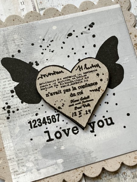
For this year’s card, I opted for some papers from the Serenity collection from 49 and Market, which has soft, lovely beige and cloudy blue colors, with their signature collage text and script patterns in the background. They are one of my favorite paper companies, because you can’t go wrong combining their colors and patterns.
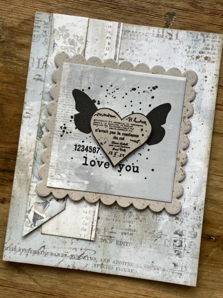
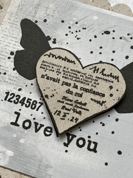
I first gently splattered the blue collage paper with light tan acrylic paint, then glued it to the card front. I inked around the outside edge with a gold metallic inkpad that is *dry-ish*, meaning that it should be re-inked but I love the soft look it gives for direct-to-paper techniques. Then I added some strips of coordinating background papers, also inked, on the side.
The stamp is from the PaperArtsy Eclectica ESN32 set. It’s an older one that I love because—well, hearts go for so many themes, and these are simple, but the collaging gives you options for simply stamping, or cutting and layering. That’s what I did here: I stamped the collage heart with black ink on the blue collage paper, then stamped it again onto beige collage paper. I cut out the beige heart, and foam-taped it onto the blue one. Then I layered the die-cut square onto a scalloped square die cut, and foam-taped that to the card front.
I love about how versatile this layout is, as well. You could definitely spice things up with a bolder color palette (pink and orange would be fun) or add in some metallics. And if you keep it soft and subtle, you can also use this one for “just because” or even sympathy cards.
Happy Valentine’s Day , friends! Enjoy!